
User Guide
This website is accessible on various devices, including tablets and smartphones.
Please note that some pages may not be available on mobile devices.
Icons and Buttons
This section explains the types and functions of icons used throughout the website.
| Icons | Description |
|---|---|
 | Opens a link |
 | Opens a link in a new window (PDF files may be downloaded automatically on Android devices) |
 | Links to external websites |
 | Opens a link optimized for smartphones |
 | Links to the desktop version of the site (for smartphone users) |
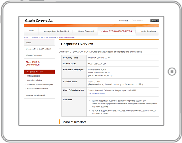
Tablet Usage
This section outlines how to use the website on tablets.
- Some pages may not be accessible on tablets.
- The website supports both horizontal (landscape) and vertical (portrait) orientations.
- When the display size exceeds 960px, the screen is optimized for horizontal viewing. Depending on your device, the screen orientation may vary.
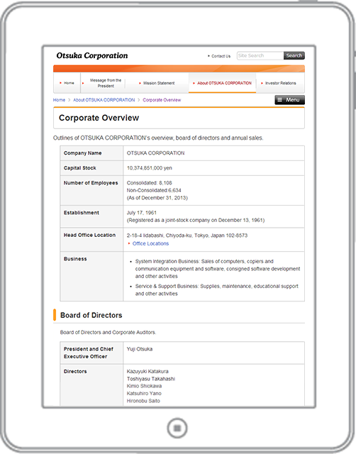
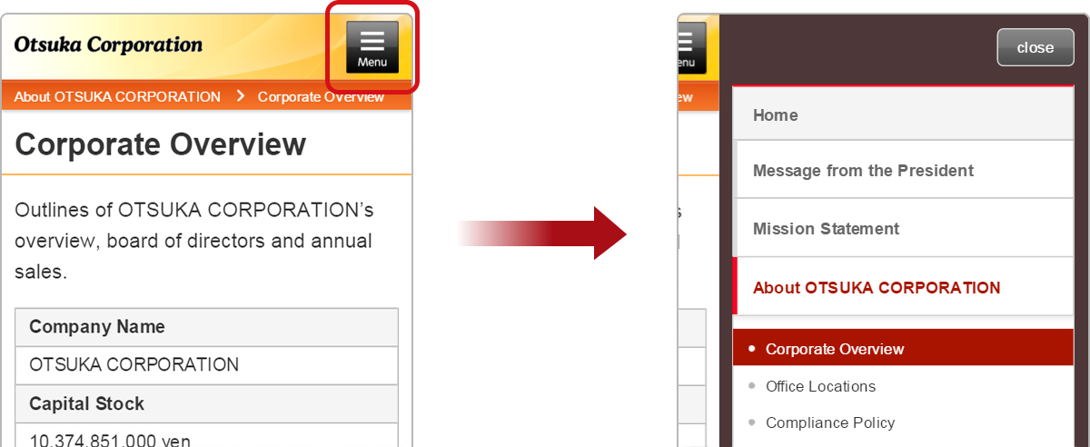
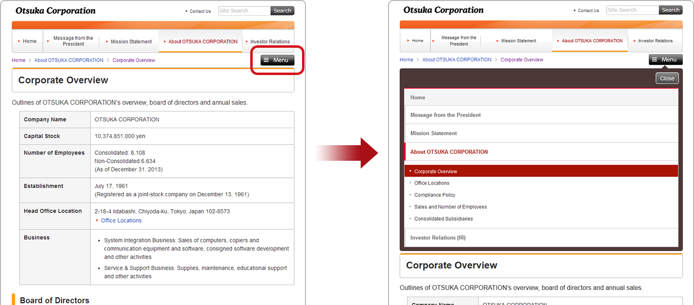
Menu Display in Portrait Mode
When using your tablet in portrait mode, the navigation menu is collapsed into the menu button located at the top right corner of the screen.
Smartphone Usage
This section provides guidance for smartphone users.
- Some pages may not be accessible on smartphones.
- To access the slide-out menu, tap the menu button in the upper right corner of the screen.